
Monday, March 22, 2010

Saturday, March 20, 2010
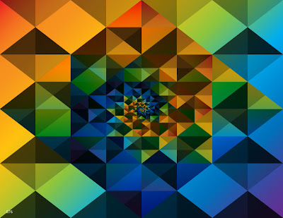
076-Spiral
I drove past a building that had a cool brick pattern this morning. I recreated it then started playing with color and blending modes. This is how it turned out. Rather Andy Gilmore.

Tuesday, March 16, 2010

Monday, March 15, 2010
074-Money
Saw this article at the ministry of type and thought I would try drawing some money-looking type with simple Guilloche patterns. Hand drawn M.


Sunday, March 14, 2010


070-Magnolia 1
I always thought magnolia blooms were made to be drawn in Illustrator I have just never done it until now. I found this great photo of Magnolia Soulangeana as a reference.


Wednesday, March 10, 2010
069-Mix-Up
Was listening to The Mix-Up by the Beastie Boys and got lost. It was a fun ride. All vector, Victor.


Tuesday, March 9, 2010

067-Emperor
Was turned on to LaBoca. Awesome geometric style. Totally inspiring. I thought I would try to recreate some of their stuff in Illustrator. For the texture, I made a blend of two stroked circles of about 50 steps, then gave it an opacity mask and used splattery brush strokes to reveal the concentric circles in certain areas. A cool way to add texture.


Monday, March 8, 2010

065-Comic Serifs
It was much funnier in my head.
I took Comic Sans and widened the vertical parts of the letter forms and added some serifs. Still looks like crap.

I took Comic Sans and widened the vertical parts of the letter forms and added some serifs. Still looks like crap.


Friday, March 5, 2010
063-Drippy
Saw this graphic and got inspired. It is not as 3d as I would like it but it gets the point across.
Font: Edwardian Script

Font: Edwardian Script

Thursday, March 4, 2010

Tuesday, March 2, 2010
061-Ribbon
Followed this tutorial today and embellished it a bit. Used Envelope Distort again. It's a powerful tool. I am realizing that the word "envelope" is not the noun like the thing that you put letters or documents into and mail but is actually the verb that means to enclose or encase completely. It makes much more sense to think of it in this way.


Monday, March 1, 2010

Saturday, February 27, 2010
058-Abstract2
Basically just experimenting with linear gradients and blending modes from this tutorial. Once again all vector.
Font: Rockwell Extra Bold

Font: Rockwell Extra Bold

Friday, February 26, 2010
057-Abstract
Watched this tutorial today. Was surprised to see how many tutorials are on YouTube. This blew my mind. Such a cool effect and way to achieve it. All vector.


Thursday, February 25, 2010

Wednesday, February 24, 2010

054-Wavy Halftone
Followed a cool tutorial tonight. Basically created a halftone from a linear gradient, live-traced it then manipulated it. Used Envelope Distort for the first time.


Monday, February 22, 2010

Sunday, February 21, 2010

051-Drop Cap E
First attempt at a drop-cap. Harder than it looks especially if you are not inspired.


Thursday, February 18, 2010


Wednesday, February 17, 2010
048-spirograph
Followed this tutorial tonight. The hardest part was making the color pallet. I also have a new hero, Andy Gilmore.


047-Sketchy Trees
My first non-vector post.
Doodling during a meeting. Abstract trees, hills and sun. Pencil on black paper.

Doodling during a meeting. Abstract trees, hills and sun. Pencil on black paper.

Tuesday, February 16, 2010
046-Another Stripe
Made something like the white shape at work today. Thought I would try running a stripe over, under and through it tonight. I'm digging the one pixel strokes for subtle shadows and hi-lites.
Font: Myriad Pro Bold

Font: Myriad Pro Bold

Monday, February 15, 2010
045-3d Lighted Text
Followed this tutorial. It took too long and I don't think I did it right and am not happy with the results. It happens. Did notice that using a complex gradient mesh significantly increases your file size.
Font: Avant Garde

Font: Avant Garde

Sunday, February 14, 2010
044-Pie
I ran across a pie chart this weekend and liked the way it showed depth by using only hilights and shadows. Tried to recreate it in Illustrator.


Saturday, February 13, 2010

Thursday, February 11, 2010
042-Blueprint
Another tutorial tonight. Gets the job done. Used a gradient mesh as a mask which is a pretty cool idea.
Font: Zurich BT Ultra Black

Font: Zurich BT Ultra Black

Wednesday, February 10, 2010
041-Rays
Found this Photoshop tutorial and thought I'd try and do it with all vectors instead.
Font: Bureau Agency Bold

Font: Bureau Agency Bold


Tuesday, February 9, 2010
039-Rope
Ran across this tutorial about how to make a climbing rope pattern brush. Very cool (as long as you don't let the ends show). Feeling a little weird about basing my numbers off of the font Giddyup.


Monday, February 8, 2010
038-Weber
Started this on Saturday when I was grilling some chicken skewers. Another study in simple shapes but with some reflections this time. Vector on the left, photo on the right.


Saturday, February 6, 2010

Thursday, February 4, 2010
035-New
Ran across the book cover for New Typographic Design and got inspired. Found out that to extrude two or more objects at the same time in the same way, they need to be a compound path first.
Fonts: Helvetica Neue 45 Light, 77 Bold Condensed

Fonts: Helvetica Neue 45 Light, 77 Bold Condensed

Wednesday, February 3, 2010
034-Inspiration
Saw these desktop wallpapers and got inspired. I don't understand why the shapes get all effed up after you expand the extrude effect. Vector texture in the background, too.
Font: Myriad

Font: Myriad

Tuesday, February 2, 2010
033-Swirls
This took way too long to have it turn out like this–a mess. Followed this tutorial on swirls. Did learn about the Feather effect and replacing the spine in a blend. Good stuff to know.


Subscribe to:
Posts (Atom)